Poster: Predicting genotype from phenotype
I presented the below poster at the 2012 American Society of Microbiology Meeting. This research demonstrates how we have been comparing and testing Pseudomonas strains for twitching motility to identify the genes responsible for phenotypic differences. Click on the image below to see a larger version.

As with my previous ASM poster, I think less text and a more visual overview is more likely to attract interest and start a discussion. ASM meetings usually have posters numbering in the thousands so I think a text-heavy poster can be a lottery for getting people to talk to you. A lighter poster, I hope, gives the impression that you're not going to trap someone who expresses an interest with ten minutes of intense conversation.
Inspiration
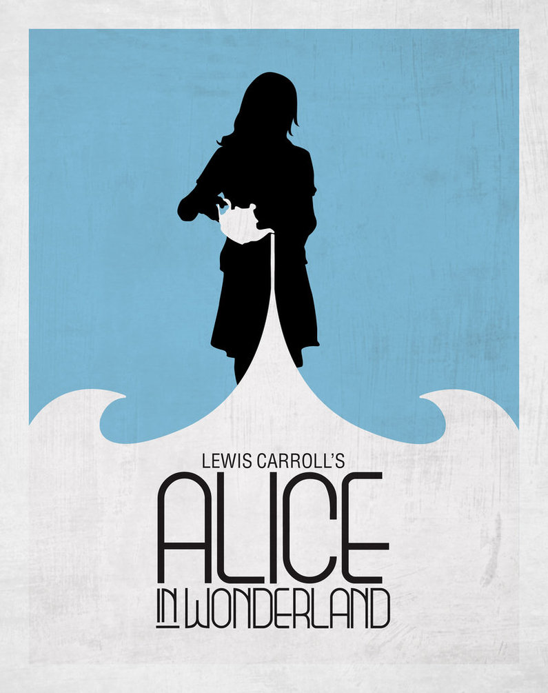
I usually get started by on a new poster by searching the posters section on Deviant Art around a theme I am interested in. In this case I felt like going for "Grunge Minimalism." There's plenty of inspiration to be found on deviant art when searching for different themes and I was particularly inspired by an Alice in Wonderland poster from deviant art (no longer available). You can see similarities in the lines and colours between this poster and how I ended up designing mine.
Planning
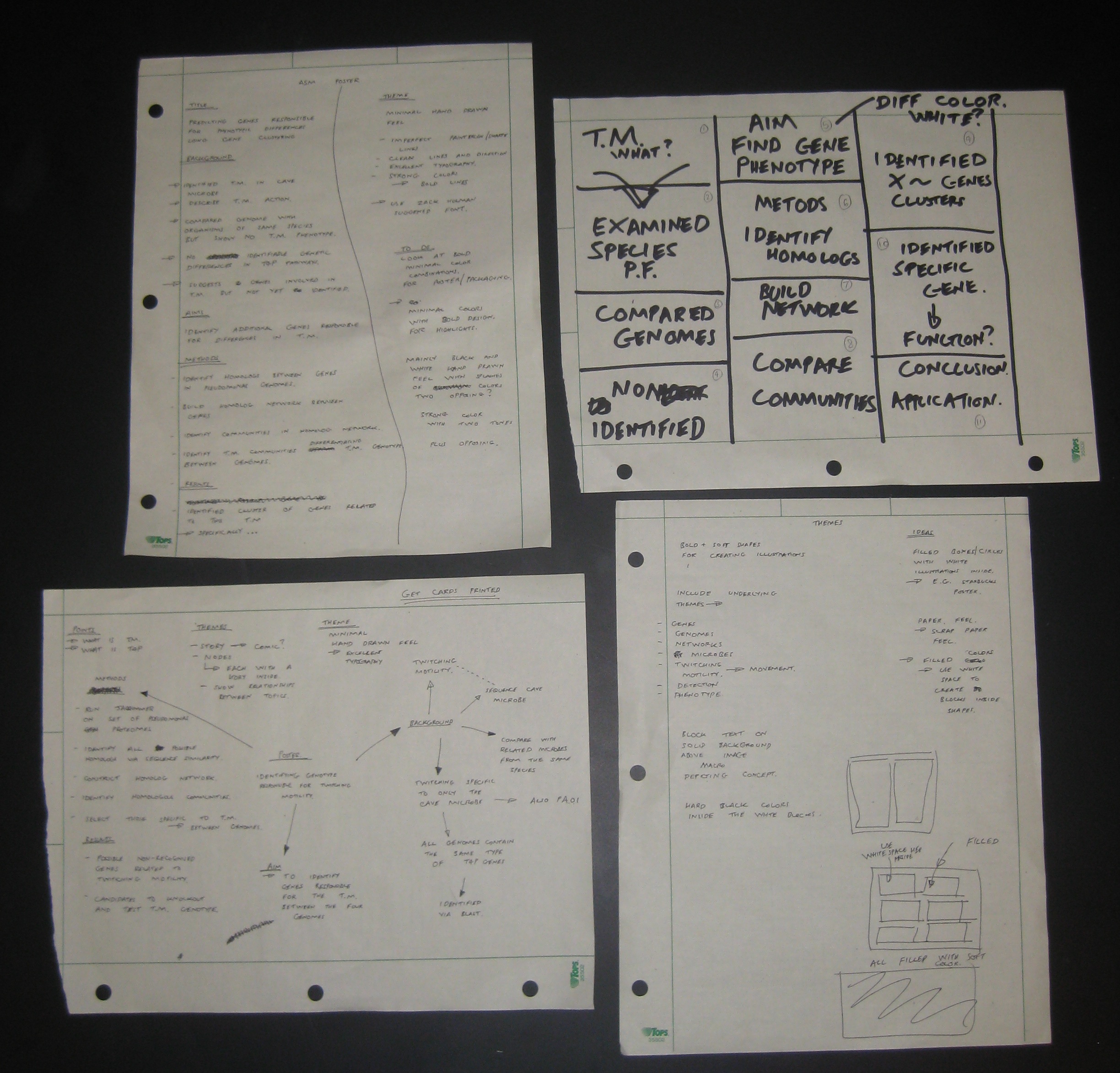
I spend a large portion of my time planning a poster before opening Inkscape. I think time spent planning tends to pay off many-fold compared with trying to plan and create at the same time. My planning is rather straight forward: write down the key points I want to include and how I will lay them out on the poster. The images below show the papers I generated while planning the poster.
Images
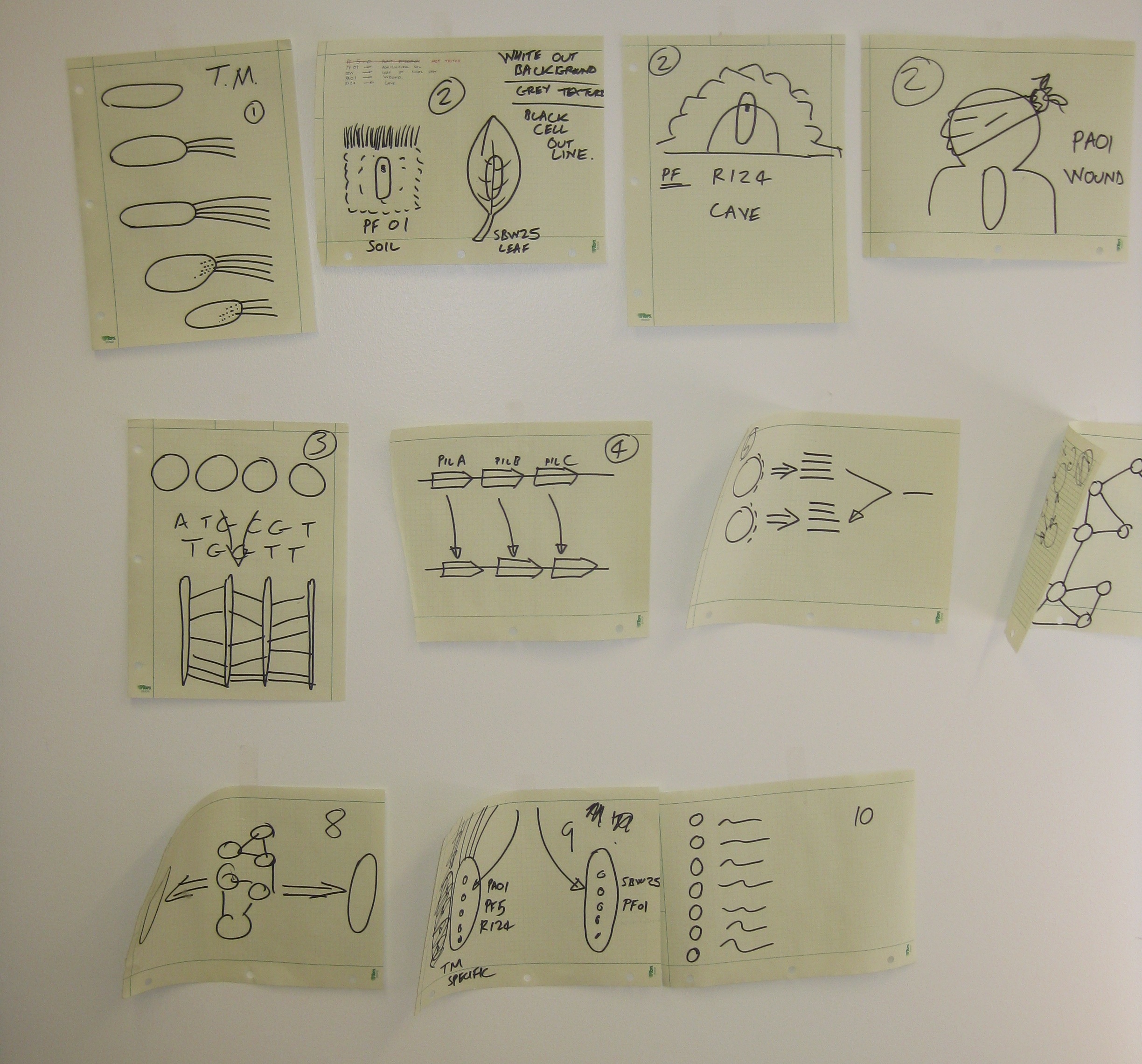
I hand drew all the images using a black pen on squared paper. I draw them on squared paper to ensure that all image have the same proportions. Squared paper is also pretty handy for making accurate representations where it matters, for instance the genes in the upper right of poster are to-scale representations of the nucleotide length. I usually go through several iterations of each drawing until I get something I'm really happy with. Below are the final drawings I used for the poster.

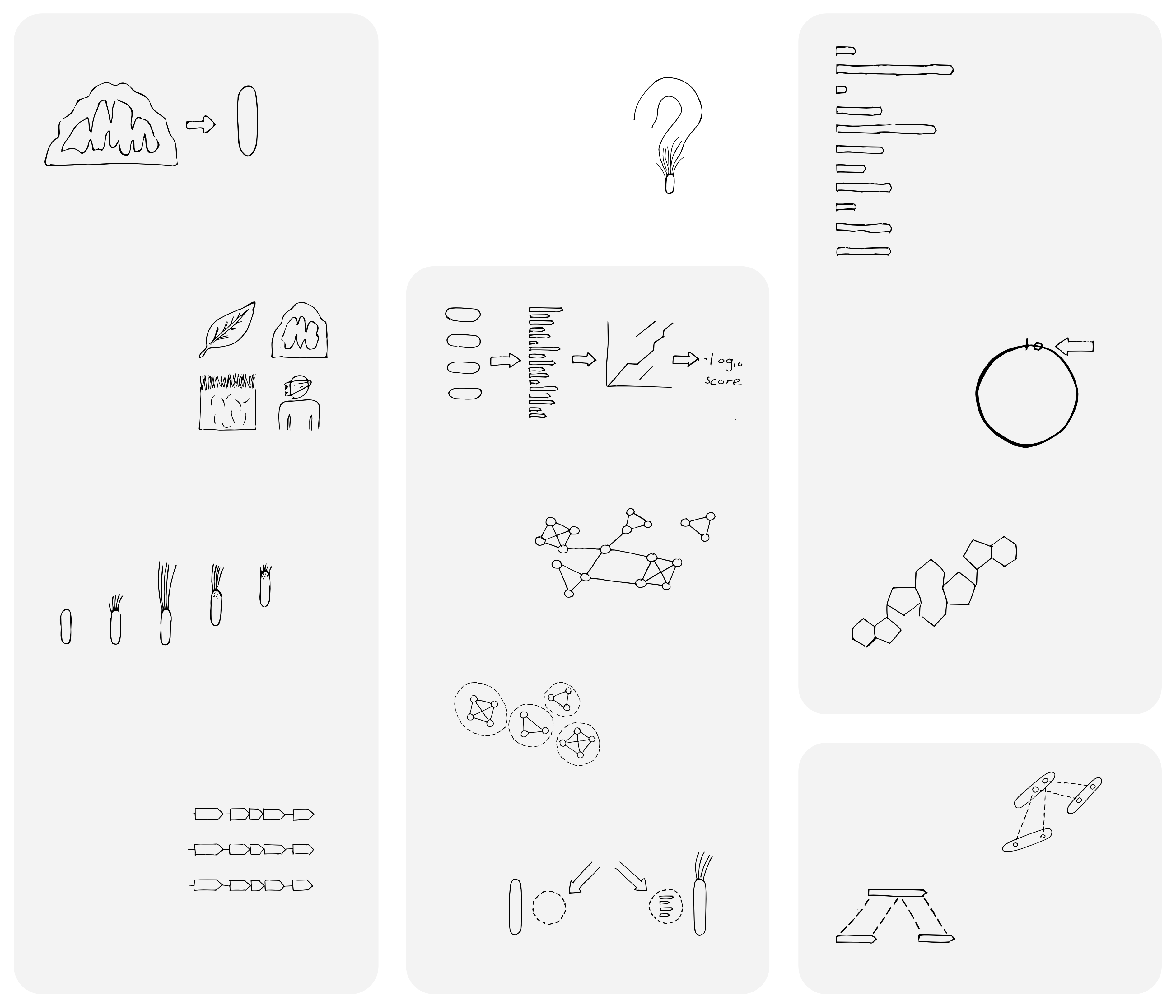
After I'm happy with the images I scan them in using a standard office scanner to get a pdf. If you're interested you can download the pdf of these scanned images. After scanning I import the pdf into Inkscape and convert each image to a path. Once in this state it is easy to simplify the object path and remove roughness or scanner artefacts. Below is the poster with the converted images.
Colours
The colours I used (blue and orange) are on opposing sides of the colour wheel and therefore complementary. Using a little colour theory can usually make a poster more visually appealing. I also experimented with how to apply these colours to the poster. I created seven different examples and asked my lab mates their opinions. The solid use of colours (upper left) was the most popular so this is the one I went for.

Font
Choosing a font is perhaps an underestimated but important point in designing a poster. A font should match the context around the text: use a serif thick font for loud and heavy impact or a lighter san-serif font for a more minimalist message. I used the Yanone Kaffeesatz after seeing it on Zack Holman's slide design for developers blog post. I recommend reading his post too as it has many good points.

Summary
These are the main points on how I created my poster. The rest was just adding text, boxes and lines in Inkscape which is quite straight forward. Even if you do struggle with Inkscape usually a quick google search for the effect you're after with find a tutorial. Overall, if I could offer a single suggestion it would be to spend a little time beforehand looking for inspiration and planning how you want your poster to look before you begin creating it.