Poster: Scaffolder software for genome finishing
I've spent time recently working on a tool to simplify genome scaffolding. I presented a poster on this at this year's American Society for Microbiology conference (ASM 2011). I find poster sessions at large conferences sometimes overwhelming. There are many posters and it can be hard to find the most relevant.
Similarly, from the opposite side, being overlooked in a room with hundreds of other posters is disheartening. I think creating and presenting a poster about software is an even harder task. Software is an abstract concept so it's difficult to relay a narrative that poster viewers will connect with. Contrast this with presenting research which benefits from a background, results, discussion storyline and, possibly, eye-catching figures.
The poster I choose to create for ASM minimised the amount text on the page. There is extensive documentation on Scaffolder so repeating this on the poster felt redundant. I also believed that large amounts of text describing the software would be forgotten. I designed the poster as a brief introduction to the software. Anyone interested in learning more could follow the short URL (http://next.gs) to the website containing more details.
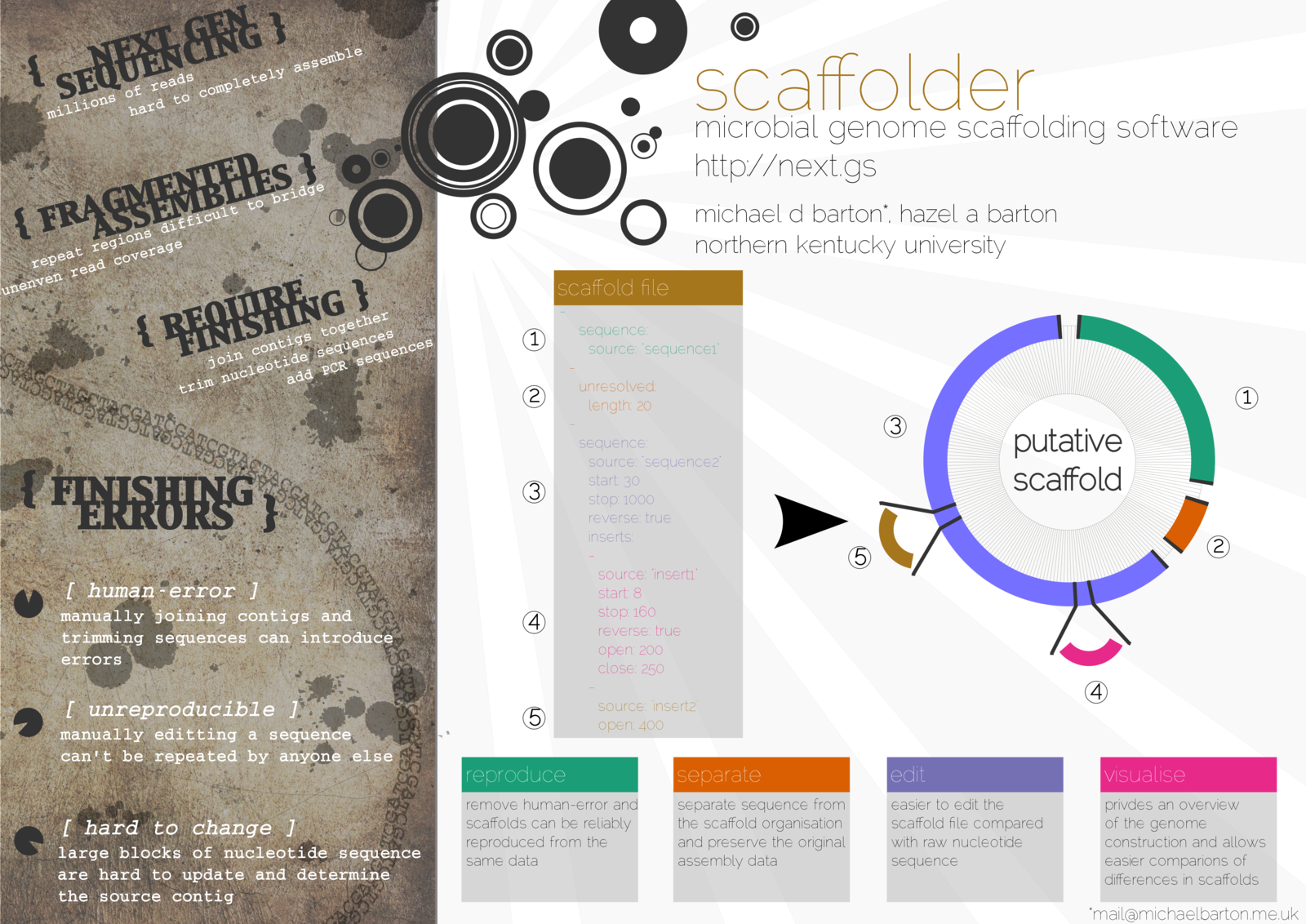
The left-hand side of the poster describes the problem of creating a genome by joining the contigs manually. The larger right-hand side illustrates the scaffolder file format and how my software solves these problems. If anyone expressed an interest in learning more I ran through a two-minute talk using the poster as a prop. I could then answer any additional questions. I think this worked well as I was able to have several conversations with people about their own genome projects.
The poster was simple to produce and took about one week. I created the poster in Inkscape and the design is composed mainly of simple shapes and text. When I struggled to produce any part of my envisaged design a Google search found plenty of Inkscape tutorials. Overall I felt that an information light, but visually appealing, design was the good way to attract interest in the software and then start a conversation.
Zen Faulkes has generously provided a critique of this posters. He raised excellent points about the using larger fonts and tidying up the title by removing the circle designs. I encourage reading this critique on his Better Posters blog.